Resource - Creator Relationship Edit UI - Mockups
Author, Editor ... Contributor Edit UI – Mockups
1. Split Lists
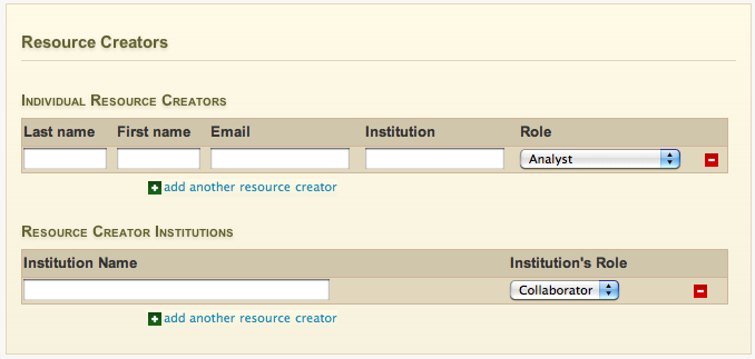
Description
This is essentially the same design as the "Institutional / Institutional" credit section. The system would retain the sequence of creators as entered by the user, however, because of the split presentation, there would be no way to construct a sequence of creators that contained different creator types.
Pros
- Data entry is arguably quicker if a resource is mostly comprised of one creator type (e.g. documents may rarely require institutional authors)
- Presentation is unambiguous – the user will won't likely enter an institution when they meant to enter an individual.
Cons
- This widget takes up more vertical space relative to the other mockups for small numbers of resource creators.
- User would not be able to, say, create a sequence where an institution was "sandwiched" between two individuals.
2. Unified – Multiline
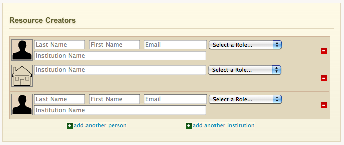
Description
This widget allows the user to institutions and individuals in any order. It differs from other "repeatable" fields on the system in that there would be two "add" buttons: one for adding individuals to the sequence, and another for adding institutions. To conserve horizontal space, the person fields are presented on multiple lines and their labels are embedded in the text-entry region. An icon on the left side further indicates the type of record the user is entering.
Pros
- Users can enter either type of creators in any order they wish.
- More compact for small numbers of creators
Cons
- In my opinion, this UI looks "busy" as you increase the number of items in the list. This may just be me.
- Widget takes up more space than the other mockups for a list containing several items.
3. Unified – Tabular
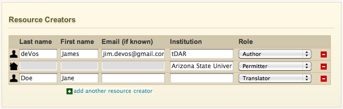
Description
This widget looks similar to the author-entry section on the document edit page. However, with widget the user implicitly specifies the resource creator type depending on which fields the user populates. For example, if the user enters text in the "institution" field and leaves the other text fields blank the system will interpret this as an institution entry (and will indicate with a miniature icon on left side)
Pros
- Most compact format of the three designs
- Quickest data entry experience, no need for two "add another" buttons.
Cons
- Presentation is potentially more confusing than the other formats.
- Field widths are small (note the text in the institution entry)
- Behavior for the autocomplete dropdowns would be tricky to perfect and could lead to confusion if not done right.